
Description
You can apply a customized Brand Kit to signature templates in the Signature Designer using signature elements. Each signature you add branded content to will use the assets you specify in your Brand Kit. You can apply one Brand Kit at a time, and any customized assets within that Brand Kit will be available in the elements and/or Properties when designing your signature.
How to access it
-
Open or create a signature in the Signature Designer.
-
In the Brand Kits section, choose and select a Brand Kit from the drop-down.
NOTE: For users on Starter plans, or if you have only created one Brand Kit, the Kit is automatically applied.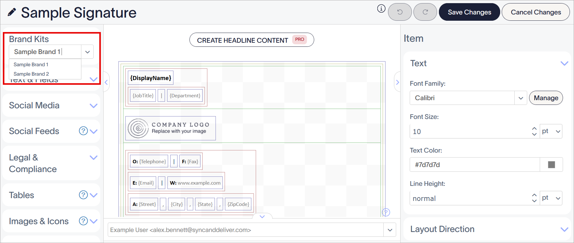
Select your Brand Kit from the drop-down. The first available Brand Kit is applied by default.
- For Logo, Banner, or Icon assets: From the Toolbox, expand the Images & Icons section and add the Image/Logo element to the canvas.
- For Fonts: Add or select any element with text. For Text, {Fields}, and Disclaimer elements, expand the Text section of the Properties pane. For the Microsoft Bookings or Calendly elements, expand the Calendar Sharing Button section.
-
For Colors: Select any element and expand the Text, Background, Border, Label Icon, Social Media Icon, Calendar Sharing Button, and/or QR code section of the Properties pane.
NOTE: The availability of Properties is dependent on the element in use. For more information on the individual properties available per element, see each element's dedicated article in the Edit Signature Design section of the knowledge base.
Resolution
To apply a Logo, Banner, or Icon, use the Image/Logo element.
- In the Image/Logo window, under What type of image do you want to insert?, ensure Brand Image is selected.
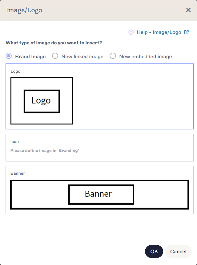
Select the Brand Image radio button to display the branded image asset options. Uploaded images are shown alongside the assets.
-
Select either Logo, Icon, or Banner.
NOTE: Your Brand Kit images are displayed on each option. If you have not uploaded an image, you can still add the option to your template; the image will display a blank placeholder until an image is added to the Brand Kit. If you upload or replace an image in your Brand Kit, all templates containing the option are updated automatically. - Select OK. Your Brand Kit image is added to the canvas.
- [Optional] Edit your image properties in the Properties pane. For more information, see Working with the Image/Logo element.
- To change the asset type, select the Brand Kit image and expand the Image Source section in the Properties pane. Select Logo, Icon, or Banner under Brand Image to choose the asset used.
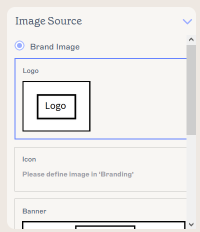
Select an asset type to switch the asset in use.
- To remove a Brand Kit asset from the template, select the image on the canvas, then select Delete from the Properties pane.
- Select Save Changes to save your signature template, or select Cancel Changes to revert any changes made.
To apply Brand Kit Fonts, use the Properties pane. Any element with text can use Brand Kit Fonts.
- In the Properties pane, select the arrow on the Font Family entry field in the appropriate section to open the drop-down menu.
-
Under Brand Fonts, the choices you set when creating your Brand Kit are displayed. Select either Brand Font 1 or Brand Font 2.
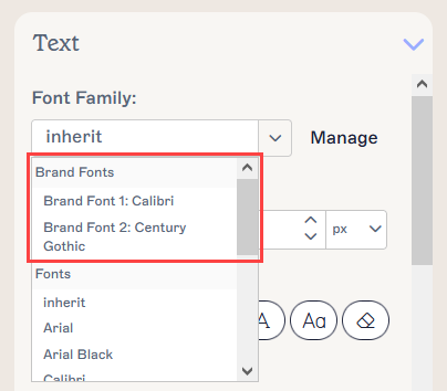
Your branded asset content appears in the Brand Fonts section of the drop-down.NOTE: If you change a Font in your Brand Kit, all templates containing the option are updated automatically. - Select Save Changes to save your signature template, or select Cancel Changes to revert any changes made.
The following table lists all the elements and properties that can use Brand Kit Fonts:
| Property name | Section of the Properties pane | Elements available for |
| Font Family | Text | |
| Font Family | Calendar Sharing Button |
To apply Brand Kit Colors, use the Properties pane. Any element property that can be colored can use Brand Kit Colors.
- In the Properties pane, open the color picker for any relevant color property by selecting the colored square.
-
Above the gradient and slider selectors, the choices you set when creating your Brand Kit are displayed. Select either Brand Color 1 or Brand Color 2.
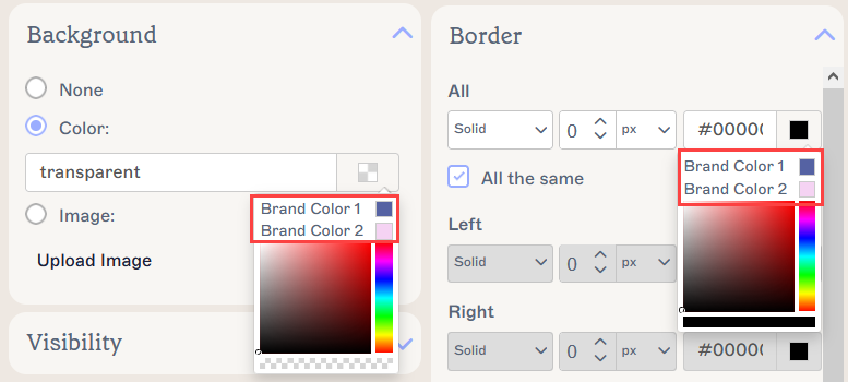
Two examples of Brand Kit colors appearing in the colour picker, for Background and for Border properties. The color picker may appear differently depending on which color property you edit.NOTE: If you change a Color in your Brand Kit, all templates containing the option are updated automatically. - Select Save Changes to save your signature template, or select Cancel Changes to revert any changes made.
The following table lists all the elements and properties that can use Brand Kit Colors:
| Property name | Section of the Properties pane | Elements available for |
|
Text |
|
|
QR Code | QR code |
|
Social Media Icon | |
|
Label Icon | Icons |
| Text Color | Calendar Sharing Button | |
| Text Color | Text |
|
| Color | Background |
|
|
Border |
|
| All | Border |
|
To apply a Disclaimer, use the Disclaimer element.
- Add a Disclaimer element to your canvas. The text you defined when creating your Brand Kit is automatically added. For more information, see Working with the Disclaimer signature element.
- Select Save changes to save your signature template, or select Cancel Changes to revert any changes made.