
Description
The Tables element allows you to add a table structure to your signature template. Elements can be placed inside table cells to create sectioning in your design. There are a series of pre-defined table shapes available to choose from, or you can create a custom table and define your own amount of rows and columns. All tables can be edited to change row, column, and cell heights and widths, and cells can be merged to control how your tables are structured.
How to access it
- Open your signature in the Signature Designer.
For more information, see how to select a signature to edit.
- From the Toolbox, expand Tables.
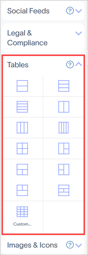
The Tables elements are found in the Tables section.
Select an option below to view the related instructions:
To add a table to the signature:
- Drag and drop a table shape onto your canvas. To create a custom table, drag and drop the Custom.. element.
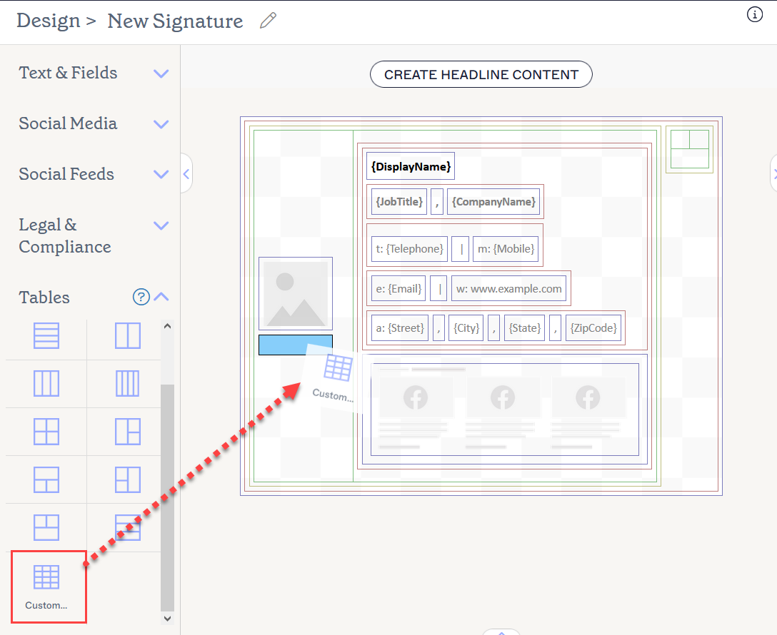
Drag and drop the table or the Custom... element to where you would like it to be on the canvas.
- If adding a custom table, this opens the Custom window. In the Columns field, enter the number of columns you want the table to have.
- In the Rows field, enter the number of rows you want the table to have.
- Select OK to add the custom table to the canvas.
You can use the Properties pane to add and remove rows and columns, alter row and column widths and heights, and merge cells.
To add or remove individual rows and columns:
- Select a cell within the table.
- Select ROWS & COLUMNS to open the drop-down list.
- Select an option to delete the currently selected row/column, or insert a new row/column above, below, or to the left or right of the currently selected cell.
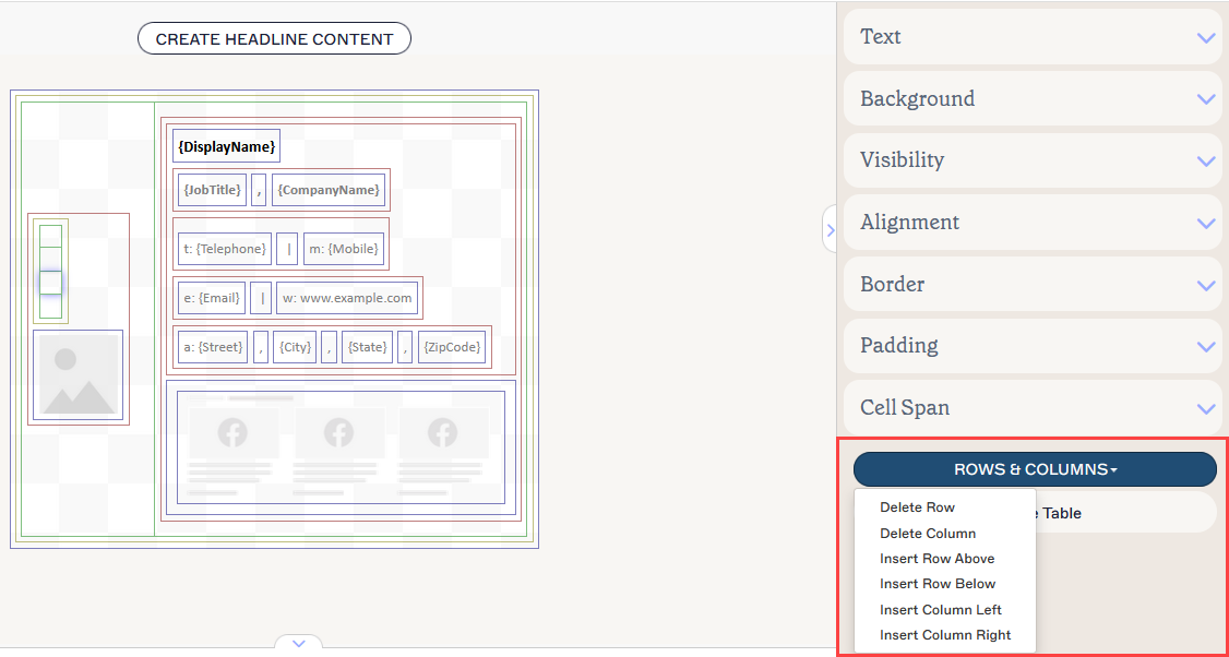
The ROWS & COLUMNS drop-down allows you to edit rows and columns respective of the current cell.
To add or remove multiple rows and columns:
- Select the table.
- In the Properties pane, expand Rows and Columns.
- Enter a value or use the arrows to increase/decrease the current value in the Rows or Columns fields.
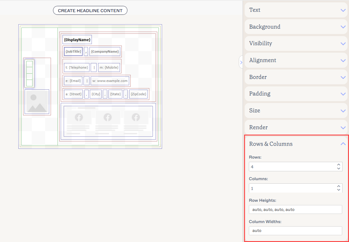
Enter or edit the number of rows and columns to adjust your table.
To adjust a row height or width:
- Select the table.
- In the Properties pane, expand Rows and Columns.
- Enter a value in Row Heights or Column Widths as appropriate. The values are listed individually for each row and/or column, separated by a comma. To adjust a specific row or column, edit the value in the appropriate place in the list. For example, to adjust the row height for the second row out of four, edit the value that is second in the list.
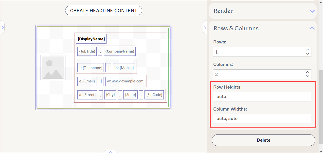
Enter or edit the heights and widths to adjust your rows and columns.
To merge cells:
- Select a cell within the table.
- From the Properties pane, expand the Cell Span section.
-
Enter a value or use the arrows to increase/decrease the current value in the Row span and Column span fields.
NOTE: A cell normally spans one row and one column. Increase the Row span to make one cell as tall as [X] number of rows. This merges your cell vertically. Increase the Column span to make one cell as wide as [X] number of columns. This merges your cell horizontally.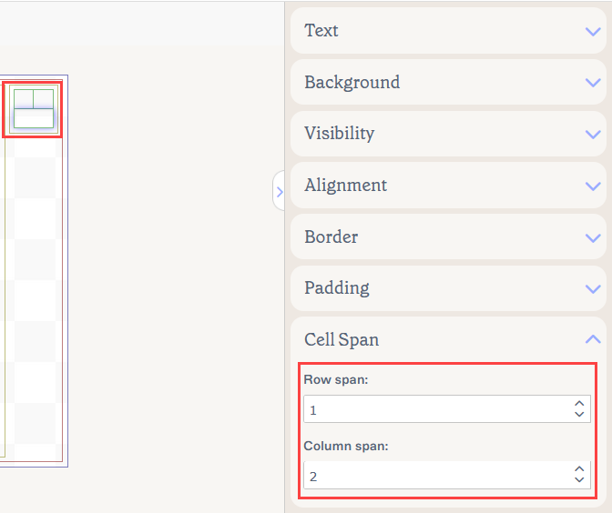
A sample table showing a merged cell that is 2 columns wide.
To delete a Table element:
- Select the element on the canvas.
-
Select Delete from the Properties pane.
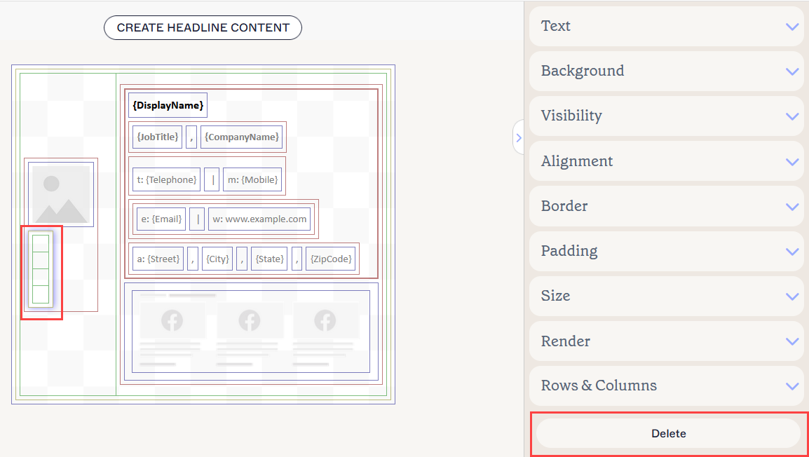
Select Delete to remove a table.Tip! you can also delete a table by selecting a cell, then selecting Delete Table from the Properties pane.
For more information, see Colored borders, grouping, and inherit properties in the Signature Designer.
You can edit the following element properties in the Properties pane:
Text properties
Text properties are used to determine the appearance of item text.
| Font Family | Select a font from the drop-down menu. The Brand Kit Fonts section of the drop-down contains font choices set on the Brand Kits screen. If you change the fonts set as Brand Font 1 or Brand Font 2 on the Branding screen, your elements set to Brand Kit fonts will automatically update to the new font choice. The default font style is Inherit - select this font style to allow your text to inherit a font style from the parent element. |
|---|---|
| Manage | Select to choose custom fonts. Select Upload Font to upload any custom fonts. |
| Font size |
Select or enter a font size in pixels (px) or points (pt).
|
| Text Color |
Enter or select the text color. You can either enter a color code or select the required color using the color picker. Brand Color 1 and Brand Color 2 appear in the color picker and contain color choices set on the Brand Kits screen. If you change these colors on the Brand Kits screen, your elements set to Brand Kit Colors will automatically update to the new color choice. |
| Line Height | Select or enter a value in pixels (px) or points (pt) to set the line height. The default value is Inherit - select this value to allow your text to inherit a line height value from the parent element. |
Background properties
Background properties are used to define the background of the item.
For more information, see the difference between background image and background color.
| None | Select None to remove any background from the text field. |
|---|---|
| Color |
Select Color to select a background color for the text field. You can either enter a color code or select the required color using the color picker. Brand Color 1 and Brand Color 2 appear in the color picker and contain color choices set on the Brand Kits screen. If you change these colors on the Brand Kits screen, your elements set to Brand Kit Colors will automatically update to the new color choice. |
| Image | Select Image to set an image as the background of the text field. |
| Upload Image | Select to upload a background image for the text field. NOTE: When you set a background image, the signature will be rendered as a bitmap image instead of HTML. |
Visibility properties
Visibility properties are used to adjust when the item appears.
| Always visible | Select to ensure the item is always visible in the signature. |
|---|---|
| Auto-hiding separator | Select to only make the item visible when there are other visible, non-separator items before and after it in the same group. |
| Visible when | Select to set conditions under which an item becomes visible. |
Alignment properties
Alignment properties are used to determine the horizontal and vertical alignment of the item.
| Horizontal | Select Left, Center, or Right to set the horizontal alignment. |
|---|---|
| Vertical | Select Top, Center, or Bottom to set the vertical alignment. |
Border properties
Border properties are used to set borders on the item.
| All |
Check All the same to enable the All border properties. Select line style, line width, and line color to apply to all sides of the item. Brand Color 1 and Brand Color 2 appear in the color picker and contain color choices set on the Brand Kits screen. If you change these colors on the Brand Kits screen, your elements set to Brand Kit Colors will automatically update to the new color choice. |
|---|---|
| Left / Right / Top /Bottom | Uncheck All the same to enable individual border properties for Left, Right, Top, and Bottom. Select line style, line width, and line color to apply to each side of the item. |
Padding properties
Padding properties are used to define spacing for the item.
| All | Check All the same to enable the All padding properties. Enter either a pixel (px) or point (pt) value to apply padding to all sides of the item. |
|---|---|
| Left / Right / Top /Bottom | Uncheck All the same to enable individual padding values for Left, Right, Top, and Bottom. Enter either a pixel or point value to apply padding to each side of the item. |
Size properties
Size properties are used to define the size of the selected field.
| Width | Enter a pixel (px) or point (pt) value to set the width of the item. Set to auto to allow the item to automatically adjust based on viewer size. |
|---|---|
| Height | Enter a pixel (px) or point (pt) value to set the width of the item. Set to auto to allow the item to automatically adjust based on viewer size. |
Render properties
Render properties are used to determine how the signature is rendered in messages.
| Normal | Select to render the signature in HTML. |
|---|---|
| Bitmap | Select to render the signature as a bitmap image. NOTE: In bitmap signatures, any externally linked images will be embedded into the signature, and text will not wrap if the field size is set to auto. |
Rows and Columns properties
| Rows | Enter a number of rows for the table or use the up and down arrows to increase or decrease the amount. |
|---|---|
| Columns | Enter a number of columns for the table or use the up and down arrows to increase or decrease the amount. |
| Row Heights | Enter a pixel (px) or point (pt) value to set the height of the rows. Set to auto to allow the item to automatically adjust based on viewer size. |
| Column Widths | Enter a pixel (px) or point (pt) value to set the width of the columns. Set to auto to allow the item to automatically adjust based on viewer size. |
Cell Span properties
Cell Span properties are used to merge cells to span multiple other rows or columns.
| Row span | Enter a number or use the up and down arrows to increase or decrease the amount of rows the selected cell is merged across. |
|---|---|
| Column span | Enter a number or use the up and down arrows to increase or decrease the amount of columns the selected cell in merged across. |