
Description
The Contact {Fields} element adds a group of up to 10 contact information fields to your signature as a block, using data from user contact details such as {Telephone}, {Fax}, {Mobile}, {Email}, and {Web}.
How to access it
- Open your signature in the Signature Designer.
For more information, see how to select a signature to edit.
- From the Toolbox, expand Text & Fields and select the Contact {Fields} element.
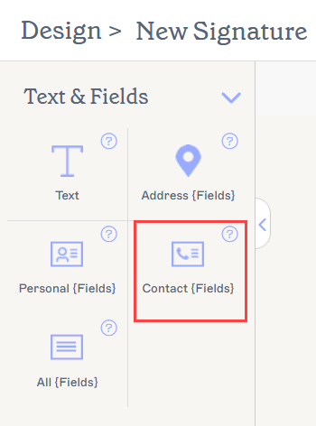
The Contact {Fields} element is found in the Text & Fields section.
Select an option below to view the related instructions:
To add a Contact {Fields} element:
- Drag and drop the Contact {Fields} element onto the canvas.
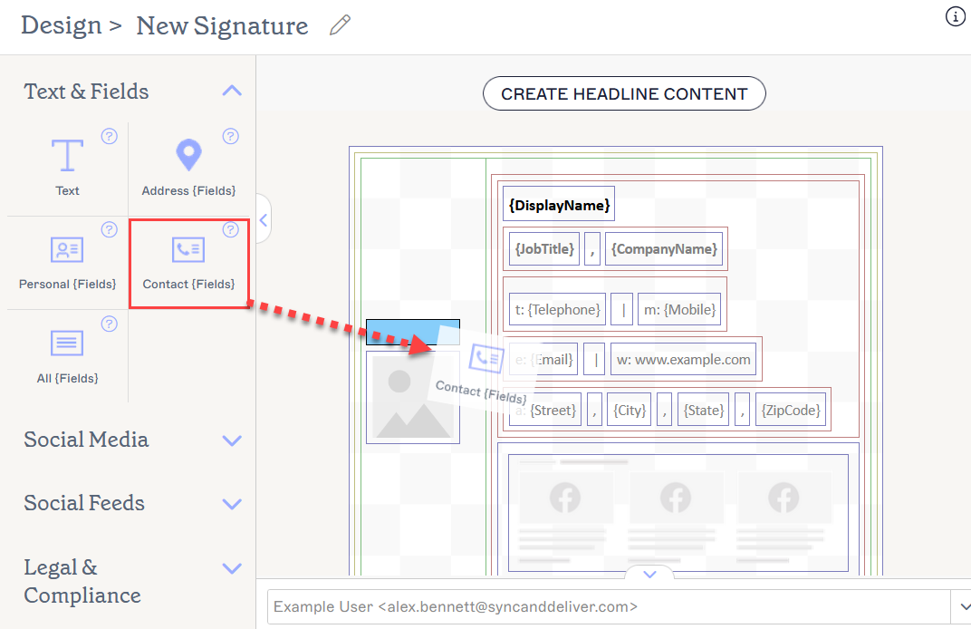
Drag the element to any area of the canvas.
This opens the Contact {Fields} window.
-
Select your fields from the Field dropdowns. To add more fields, select ADD {FIELD}. To remove a field, select the bin icon.
NOTE: You can add up to a maximum of 10 fields.Each contact field is limited to a single piece of information.
Tip! You can add custom fields for data that is not included in the Standard data fields. For more information on custom fields, see How to add custom fields to your signature.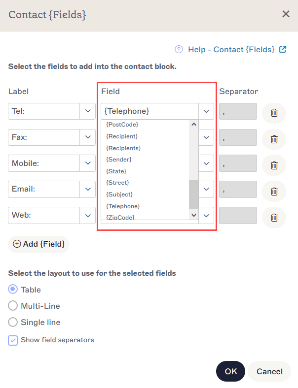
Choose your fields from the Field dropdowns.
- To add labels which appear before your fields, either select a label icon from the Label dropdowns or enter a text label.
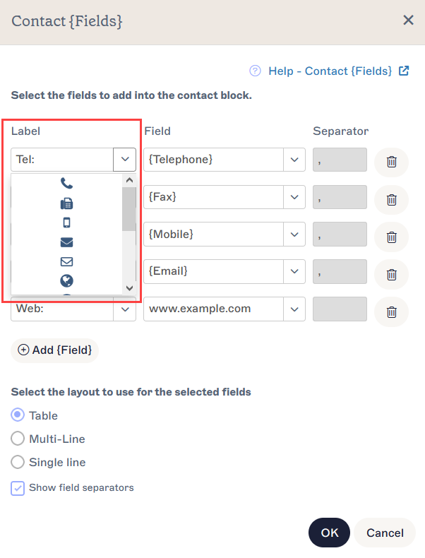
Labels are optional icons or text that preface your fields.
-
Select a layout option under Select the layout to use for the selected fields.
Select Table to display the fields in a table, with one field per row.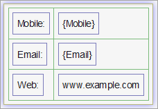
Table places your fields in a table structure.
Select Muti-Line to display each field on a separate line.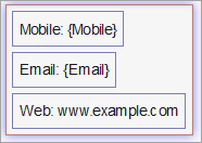
Multi-Line places your fields on separate lines.
Select Single Line to display the fields on the same line.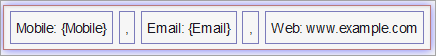
Single Line places your fields together on on the same line.
Select Show field separators to use the defined separators in between each field in the line.NOTE: Field separators will automatically hide if the field on either side is blank in Microsoft 365 or Azure AD. - Select OK to confirm your choices and close the window, or select Cancel to return to the canvas without saving.
To remove a Contact {Fields} element from the signature:
- To remove a group of Contact {Fields}, select the outer border of the fields then select Delete from the Properties pane.
-
To remove a single field from a group of Contact {Fields}, select the border of the single field within the group then select Delete from the Properties pane.
NOTE: The coloured lines around the canvas and elements show the borders of each piece of content. The outermost coloured line of a group of elements selects all the content within. For more information on canvas borders, see Colored borders, grouping, and inherit properties in the Exclaimer Signature Designer.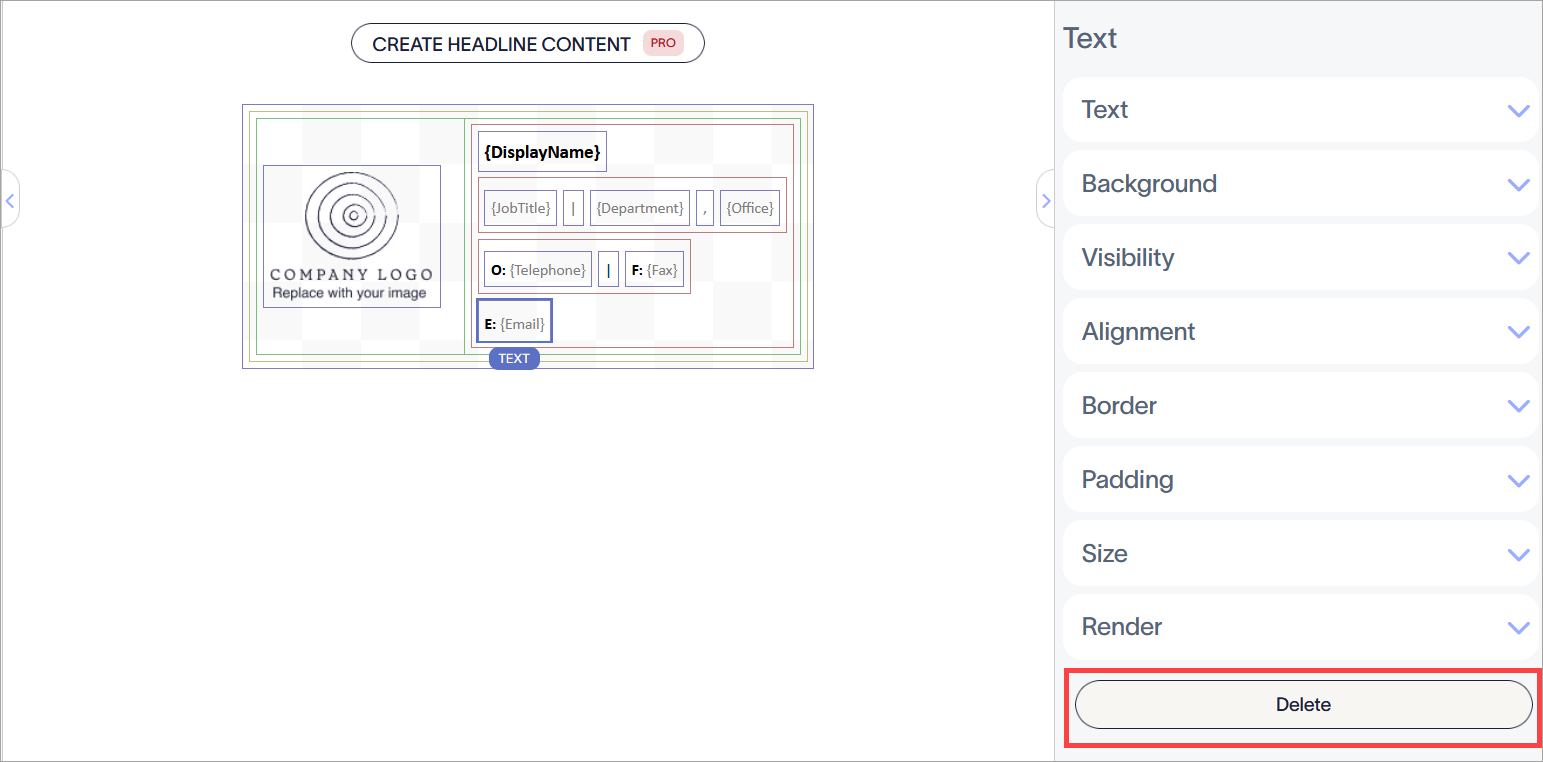
The Delete button is found in the Properties pane. You may need to close Properties sections to view it.
For more information, see Colored borders, grouping, and inherit properties in the Signature Designer.
You can edit the following element properties in the Properties pane:
Text properties
Text properties are used to determine the appearance of item text.
| Font Family | Select a font from the drop-down menu. The Brand Kit Fonts section of the drop-down contains font choices set on the Brand Kits screen. If you change the fonts set as Brand Font 1 or Brand Font 2 on the Branding screen, your elements set to Brand Kit fonts will automatically update to the new font choice. The default font style is Inherit - select this font style to allow your text to inherit a font style from the parent element. |
|---|---|
| Manage | Select to choose custom fonts. Select Upload Font to upload any custom fonts. |
| Font size |
Select or enter a font size in pixels (px) or points (pt).
|
| Formatting | Select Bold, Italics, Underline, Small, Caps, Upper Case, or Lower Case to apply formatting to your text. Select Clear Formatting to remove text formatting. |
| Hyperlink | Select Add Hyperlink to add a hyperlink and tooltip to the selected text. |
| Foreground Color |
Enter or select the foreground colour of the text. You can either enter a color code or select the required color using the color picker. Brand Color 1 and Brand Color 2 appear in the color picker and contain color choices set on the Brand Kits screen. If you change these colors on the Brand Kits screen, your elements set to Brand Kit Colors will automatically update to the new color choice. |
| Background Color |
Enter or select the background colour of the text. You can either enter a color code or select the required color using the color picker. Brand Color 1 and Brand Color 2 appear in the color picker and contain color choices set on the Brand Kits screen. If you change these colors on the Brand Kits screen, your elements set to Brand Kit Colors will automatically update to the new color choice. |
| Text Direction |
Select Inherit to inherit the direction of the text from the parent element. Select Left to Right to align your text to read from left to right. Select Right to Left to align your text to read from right to left. |
| Line Height | Select or enter a value in pixels (px) or points (pt) to set the line height. The default value is Inherit - select this value to allow your text to inherit a line height value from the parent element. |
| Text Wrapping | Select Wrap or No Wrap to enable or disable text wrapping. NOTE: When a signature is rendered as a bitmap image, text will only wrap if it has a fixed width. |
Background properties
Background properties are used to define the background of the item.
For more information, see the difference between background image and background colour.
| None | Select None to remove any background from the text field. |
|---|---|
| Color |
Select Color to select a background colour for the text field. You can either enter a color code or select the required color using the color picker. Brand Color 1 and Brand Color 2 appear in the color picker and contain color choices set on the Brand Kits screen. If you change these colors on the Brand Kits screen, your elements set to Brand Kit Colors will automatically update to the new color choice. |
| Image | Select Image to set an image as the background of the text field. |
| Upload Image | Select to upload a background image for the text field. NOTE: When you set a background image, the entire signature will be rendered as a bitmap image instead of HTML. |
Visibility properties
Visibility properties are used to adjust when the item appears.
| Always visible | Select to ensure the item is always visible in the signature. |
|---|---|
| Auto-hiding separator | Select to only make the item visible when there are other visible, non-separator items before and after it in the same group. |
| Visible when | Select to set conditions under which an item becomes visible. |
Alignment properties
Alignment properties are used to determine the horizontal and vertical alignment of the item.
| Horizontal | Select Left, Center, or Right to set the horizontal alignment. |
|---|---|
| Vertical | Select Top, Center, or Bottom to set the vertical alignment. |
Border properties
Border properties are used to set borders on the item.
| All |
Check All the same to enable the All border properties. Select line style, line width, and line colour to apply to all sides of the item. Brand Color 1 and Brand Color 2 appear in the color picker and contain color choices set on the Brand Kits screen. If you change these colors on the Brand Kits screen, your elements set to Brand Kit Colors will automatically update to the new color choice. |
|---|---|
| Left / Right / Top /Bottom | Uncheck All the same to enable individual border properties for Left, Right, Top, and Bottom. Select line style, line width, and line colour to apply to each side of the item. |
Padding properties
Padding properties are used to define spacing for the item.
| All | Check All the same to enable the All padding properties. Enter either a pixel or point value to apply padding to all sides of the item. |
|---|---|
| Left / Right / Top /Bottom | Uncheck All the same to enable individual padding values for Left, Right, Top, and Bottom. Enter either a pixel or point value to apply padding to each side of the item. |
Size properties
Size properties are used to define the size of the selected field.
| Width | Enter a pixel (px) or point (pt) value to set the width of the item. Set to auto to allow the item to automatically adjust based on viewer size. |
|---|---|
| Height | Enter a pixel (px) or point (pt) value to set the width of the item. Set to auto to allow the item to automatically adjust based on viewer size. |
Render properties
Render properties are used to determine how the signature is rendered in messages.
| Normal | Select to render the signature in HTML. |
|---|---|
| Bitmap | Select to render the signature as a bitmap image. NOTE: In bitmap signatures, any externally linked images will be embedded into the signature, and text will not wrap if the field size is set to auto. |
Orientation Properties
Orientation properties are used to set the orientation of the {Fields} group block.
NOTE: Orientation properties are not available when editing an individual field.
| Horizontal | Select to display the fields horizontally. |
|---|---|
| Vertical | Select to display the fields vertically. |
Fields may also not appear if they are multi-value, as only single-value fields can be used. For more information, see Which fields are multi value and cannot be synced to Exclaimer?