
In the Signature Designer, different sections and elements of the template are marked by different colored borders.
A sample template. There are several colored borders surrounding the elements, in various levels of nesting.
These borders help you control how the elements in the template fit together, and how the properties of different elements are defined. Hover over a section, element, or border on the canvas to bold the line for easier viewing, and select a border to select everything contained within it.
When you select a border, the border becomes blue and bold. A name label appears to tell you what you have selected.
The different borders
Templates contain the following border types:
The canvas border
The canvas border is a blue line that contains the entire signature canvas.
When you have created a new blank signature and no elements have been added, you have a blank canvas. This is the first level of the signature template. Select this border to select everything on the canvas.
A blank canvas. The outer blue border is selected. This is the canvas border.
Element borders
Each element is bordered by a blue line. This is the lowest level of the signature template; individual elements cannot be nested. Select either the element data or the blue line to select an element.
An element selected on the canvas. The blue border is bold and has a label to show that, in this case, it is a Text element which is selected.
Table borders
Tables are bordered by gold lines. The cells of the table are bordered by green lines. The green borders show the table structure. Select a green border to select an individual table cell, or select the gold border to select the whole table. Elements and Groups can be nested inside table cells.
A table cell selected on the canvas. The green border has turned blue and bold, with a name label, to show what is selected. The gold border appears around the green borders.
Group borders
Grouped sections are bordered by a red line. A Group is any collection of elements contained within the same border. Groups can be nested; selecting any Group border selects all other Groups and elements within it.
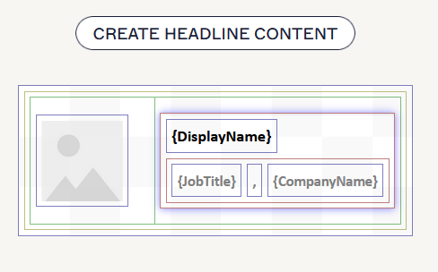
A Group selected on the canvas. The red border has turned blue and bold, and the name label shows that the group (container) is selected. There are other groups inside this group, as shown by the nested red borders.
Using bordered sections
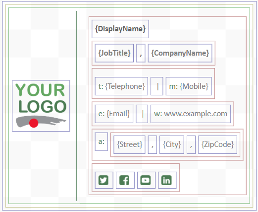
To demonstrate how borders work in a signature, look at the example of a template below.
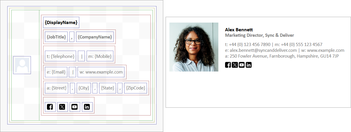
A screenshot of a sample template. The first image is the template on the canvas, and the second is how the template looks in an email.
The bordered sections affect the layout of the template. The green table cells create the alignment structure of the image- and text-based elements in the example template, and the red Groups control the layout of the blue elements within.
Select a border to select everything within it. The border of the chosen element or section has a highlight and shadow to indicate what is selected.
All other bordered sections inside your selected border are also considered selected. For example, selecting the outer border of a table also selects all the cells, Groups, and elements inside the table.
This means that any formatting options you apply from the Properties pane are also applied to everything selected.
The inherit value
Many formatting options, such as fonts or sizes, in the Properties pane can use a value called inherit. The inherit value is applied by default to new canvases or elements.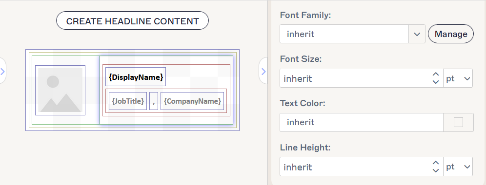
A table cell showing that the Text properties of the cell are set to inherit. This means that any text-based elements inside this cell will inherit the Text properties of the next border up - in this case, the gold border of the whole table or the blue border of the whole canvas.
When the inherit value is applied to the properties of a bordered section, all properties settings will be inherited from the settings of the next section up. For example, if you add an element to the canvas inside a Group border or to a table cell, any settings you applied to the Group or table will be applied to the new element.
If you add any table, Group, or element to a blank canvas, the item will inherit any properties you applied to the canvas itself. Canvas properties are set to inherit by default.
To change an individual set of properties, edit them in the Properties pane for the selected element.
Group elements
Some elements, such as Address {Fields}, Contact {Fields}, Personal {Fields}, All {Fields} or Social Media Strip, add multiple individual fields to the canvas. This creates an automatic Group, with each field inside the red Group border. All elements within the Group inherit group properties automatically. To change properties for an individual field within a Group, select the border of the specific field first.