
Beschreibung
Das Bild/Logo-Element ermöglicht es Ihnen, kleine Bilder zu Ihren Signaturdesigns hinzuzufügen, einschließlich Brand Kit-Bilder. Es funktioniert auf die gleiche Weise wie das Banner-Element, ist jedoch für kompaktere Bilder wie Logos konzipiert.
Zugriff darauf
- Öffnen Sie Ihre Signatur im Signaturdesigner.
Weitere Informationen finden Sie unter, wie Sie eine Signatur zum Bearbeiten auswählen.
- Erweitern Sie im Werkzeugkasten Bilder & Symbole und wählen Sie das Bild/Logo-Element aus.
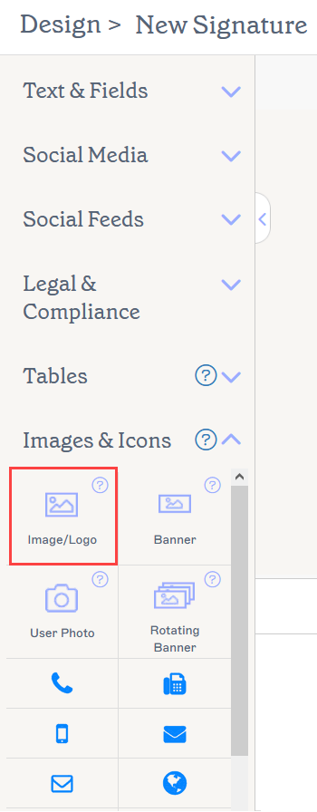
Das Bild/Logo-Element befindet sich im Abschnitt Bilder & Symbole.
Wählen Sie unten eine Option, um die zugehörigen Anweisungen anzuzeigen:
So fügen Sie ein Bild/Logo hinzu:
- Mindestmaße: 4 x 4px
- Höchstmaße: 2048 x 2048px
- Maximale Größe: 300KB
- Dateierweiterungen: .jpg, .jpeg, .gif, .png, .bmp Für weitere Informationen zum Ändern der Bildgröße, um die Pixelanforderungen zu erfüllen, siehe unseren Bildgrößenanpassungsleitfaden.
-
Ziehen Sie das Bild/Logo-Element per Drag & Drop auf Ihre Arbeitsfläche.
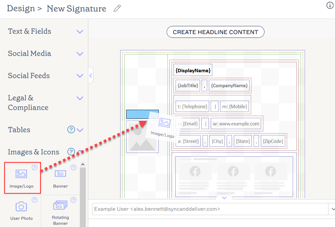
Ziehen Sie das Element in einen beliebigen Bereich der Arbeitsfläche.
Dies öffnet das Fenster Bild/Logo.
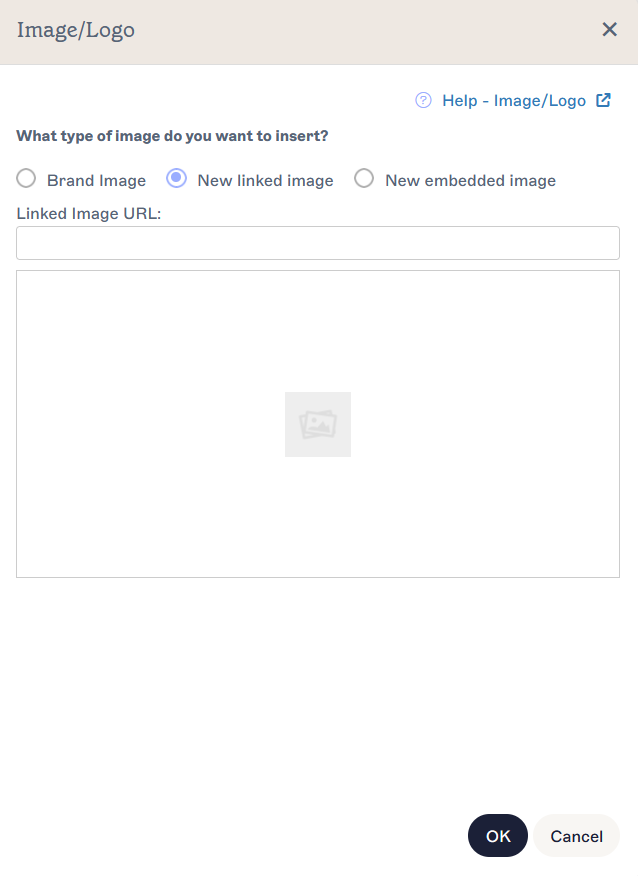
Das Fenster Bild/Logo enthält die Anpassungsoptionen.HINWEIS: Ein Bild oder Logo kann direkt in die Signatur eingebettet oder extern über einen Weblink gehostet werden. Für weitere Informationen lesen Sie über die Unterschiede zwischen und verknüpften Bildern in E-Mail-Signaturen. - Um Branding-Bilder hinzuzufügen, wählen Sie die Optionsschaltfläche Brand Kit Bild. Dies öffnet den Tab Brand Kit Bild, der Vorschauen aller Brand Kit Bilder anzeigt, die Sie hinzugefügt haben. Wählen Sie entweder Logo, Icon oder Banner. Wenn Sie noch keine Brand Kit Bilder hochgeladen haben, wird ein leerer Platzhalter auf Ihrer Arbeitsfläche hinzugefügt, der sich aktualisiert, sobald Sie Bilder im Brand Kits-Bildschirm hinzufügen. Für weitere Informationen siehe Wie man Brand Kit Inhalte in einer Signatur verwendet.
-
Um ein verknüpftes Bild hinzuzufügen, wählen Sie die Optionsschaltfläche Neues verknüpftes Bild. Dies öffnet den Tab Verknüpftes Bild. Geben Sie die URL Ihres webgehosteten Bildes in URL des verknüpften Bildes ein. Eine Vorschau des Bildes wird im Fenster angezeigt.
Tipp! Um dynamische Bilder einzustellen, die sich mit jedem Benutzer ändern, siehe Wie man verknüpfte Bilder mit benutzerdefinierten Feldern einstellt. - Um ein hinzuzufügen, wählen Sie die Optionsschaltfläche Neues eingebettetes Bild. Dies öffnet den Tab Eingebettetes Bild. Wählen Sie Bild hochladen, wählen Sie Ihre Bilddatei aus und klicken Sie auf Öffnen. Eine Vorschau des Bildes wird im Fenster angezeigt.
- Wählen Sie OK, um Ihre Bildauswahl zu bestätigen und das Fenster zu schließen, oder wählen Sie Abbrechen, um ohne Speichern zur Arbeitsfläche zurückzukehren.
So entfernen Sie ein Bild/Logo:
- Wählen Sie das Element auf der Leinwand aus.
- Wählen Sie im Bereich Eigenschaften Löschen aus.
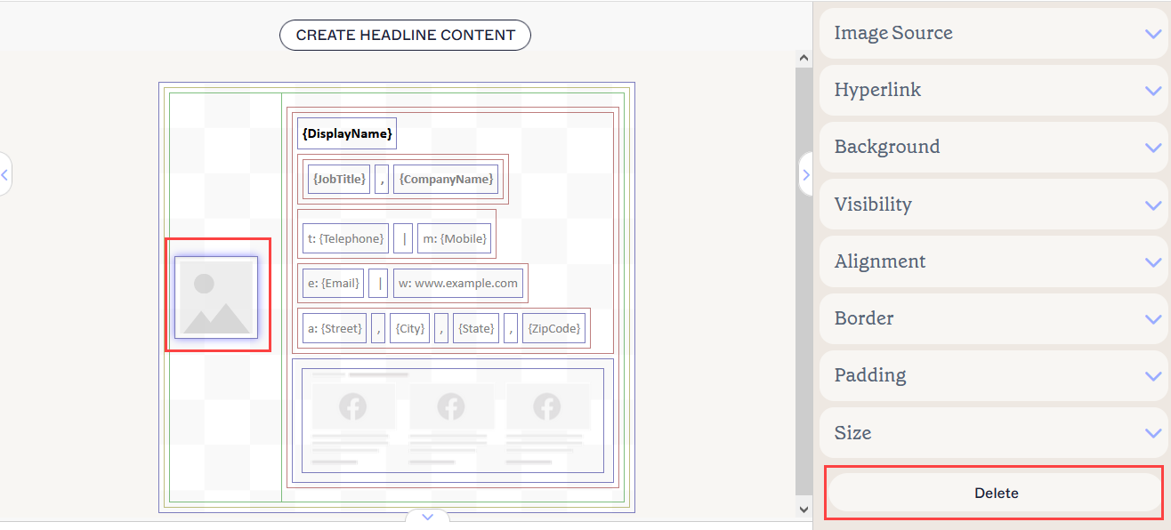
Die Schaltfläche „Löschen“ befindet sich im Bereich „Eigenschaften“. Möglicherweise müssen Sie Eigenschaftsabschnitte schließen, um sie anzuzeigen.
Sie können die folgenden Element-Eigenschaften im Eigenschaften-Bereich bearbeiten:
Bildeigenschaften der Quelle
Bild-Eigenschaften werden verwendet, um den Bildtyp und die Dateiquelle anzugeben.
Weitere Informationen finden Sie unter vs. verknüpfte Bilder in E-Mail-Signaturen.
| Brand Kit Bild | Wählen Sie aus, um Ihr Bild als Logo, Symbol oder Banner aus dem aktiven Brand Kit festzulegen. |
|---|---|
| URL des verknüpften Bildes | Wählen Sie aus, um Ihr Bild als verknüpftes Bild festzulegen. Geben Sie die Bild-URL ein. |
| Hochladen eingebettetes Bild | Wählen Sie aus, um Ihr Bild als eingebettetes Bild festzulegen. |
| Bild hochladen |
Wählen Sie aus, um eine eingebettete Bilddatei hochzuladen.
|
Hyperlink-Eigenschaften
Hyperlink-Eigenschaften werden verwendet, um dem Bild einen Hyperlink zuzuweisen.
| Ziel-URL | Geben Sie die URL ein, die im Hyperlink verwendet werden soll. |
|---|---|
| Alternativtext | Geben Sie einen Alternativtext ein, der angezeigt wird, falls dieses Bild nicht dargestellt werden kann. |
Hintergrund-Eigenschaften
Hintergrund-Eigenschaften werden verwendet, um den Hintergrund des Elements zu definieren.
| Hintergrund |
Wählen Sie Farbe, um eine Hintergrundfarbe auszuwählen. Sie können entweder einen Farbcode eingeben oder die gewünschte Farbe mit dem Farbwähler auswählen. Markenfarbe 1 und Markenfarbe 2 erscheinen im Farbwähler und enthalten Farbauswahlen, die auf dem Brand Kits-Bildschirm festgelegt sind. Wenn Sie diese Farben auf dem Branding-Bildschirm ändern, werden Ihre auf Markenkit-Farben eingestellten Elemente automatisch auf die neue Farbauswahl aktualisiert. |
|---|
Sichtbarkeitseigenschaften
Sichtbarkeit-Eigenschaften werden verwendet, um einzustellen, wann das Element angezeigt wird.
| Immer sichtbar | Wählen Sie diese Option, um sicherzustellen, dass das Element immer in der Signatur sichtbar ist. |
|---|---|
| Automatisch ausblendender Trenner | Diese Option ist für Bilder nicht gültig. |
| Sichtbar wenn | Wählen Sie diese Option, um Bedingungen festzulegen, unter denen ein Element sichtbar wird. |
Ausrichtungseigenschaften
Ausrichtung-Eigenschaften werden verwendet, um die horizontale und vertikale Ausrichtung des Elements zu bestimmen.
| Horizontal | Wählen Sie Links, Zentriert oder Rechts, um die horizontale Ausrichtung festzulegen. |
|---|---|
| Vertikal | Wählen Sie Oben, Zentriert oder Unten, um die vertikale Ausrichtung festzulegen. |
Rahmeneigenschaften
Rahmen-Eigenschaften werden verwendet, um Rahmen am Element festzulegen.
| Alle |
Aktivieren Sie Alle gleich, um die Alle Rahmen-Eigenschaften zu aktivieren. Wählen Sie Linienart, Linienbreite und Linienfarbe aus, die auf alle Seiten des Elements angewendet werden sollen. Markenfarbe 1 und Markenfarbe 2 erscheinen im Farbwähler und enthalten Farboptionen, die auf dem Brand Kits-Bildschirm festgelegt sind. Wenn Sie diese Farben auf dem Brand Kits-Bildschirm ändern, werden Ihre auf Brand Kit Farben eingestellten Elemente automatisch auf die neue Farbauswahl aktualisiert. |
|---|---|
| Links / Rechts / Oben / Unten | Deaktivieren Sie Alle gleich, um individuelle Rahmen-Eigenschaften für Links, Rechts, Oben und Unten zu aktivieren. Wählen Sie Linienart, Linienbreite und Linienfarbe aus, die auf jede Seite des Elements angewendet werden sollen. |
Abstandseigenschaften
Abstand-Eigenschaften werden verwendet, um den Abstand für das Element zu definieren.
| Alle | Aktivieren Sie Alle gleich, um die Alle Abstandseigenschaften zu aktivieren. Geben Sie entweder einen Pixel- oder Punktwert ein, um den Abstand auf alle Seiten des Elements anzuwenden. |
|---|---|
| Links / Rechts / Oben / Unten | Deaktivieren Sie Alle gleich, um individuelle Abstandswerte für Links, Rechts, Oben und Unten zu aktivieren. Geben Sie entweder einen Pixel- oder Punktwert ein, um den Abstand auf jede Seite des Elements anzuwenden. |
Größeigenschaften
Größe-Eigenschaften werden verwendet, um die Größe des ausgewählten Feldes zu definieren.
| Breite |
Geben Sie einen Pixel- (px) oder Punktwert (pt) ein, um die Breite des Elements festzulegen. Setzen Sie ENTWEDER den Breiten- ODER Höhenwert auf auto, damit sich das Element automatisch an die Größe des Betrachters anpasst. Wenn beide Werte auf auto gesetzt sind, wird das Bild in seiner Standardgröße angezeigt. |
|---|---|
| Höhe |
Geben Sie einen Pixel- (px) oder Punktwert (pt) ein, um die Höhe des Elements festzulegen. Setzen Sie ENTWEDER den Breiten- ODER Höhenwert auf auto, damit sich das Element automatisch an die Größe des Betrachters anpasst. Wenn beide Werte auf auto gesetzt sind, wird das Bild in seiner Standardgröße angezeigt. |