
Description
The User Photo element enables you to include user photos uploaded using the User Photos feature within your signature. Image files uploaded as user photos are embedded into the signature template depending on the email sender.
How to access it
- Open your signature in the Signature Designer.
For more information, see how to select a signature to edit.
- From the Toolbox, expand the Images & Icons section and select the User Photo element.
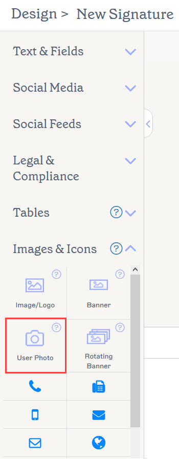
The User Photos element is founf in the Images & Icons section.
Select an option below to view the related instructions:
To add a User Photo element to the signature
- Drag and drop the User Photo element onto the canvas.
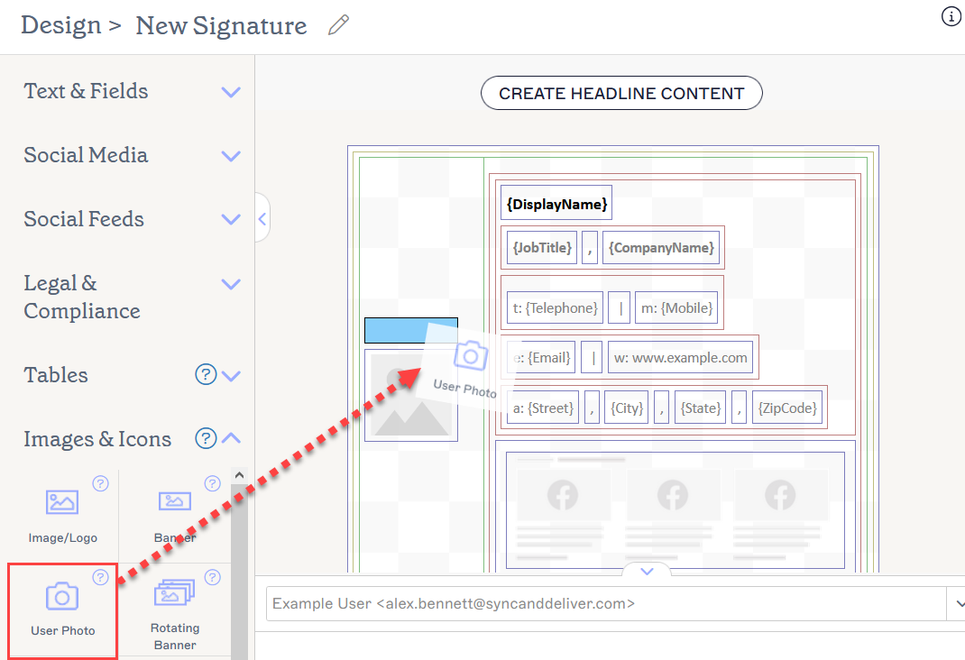
Drag the element to where you would like it to be.
-
The element is displayed as a placeholder, as the image changes based on the sender. The photo is shown in the Preview pane. To view how the element will look for different users, enter a user's name or email address into the user bar above the Preview pane.
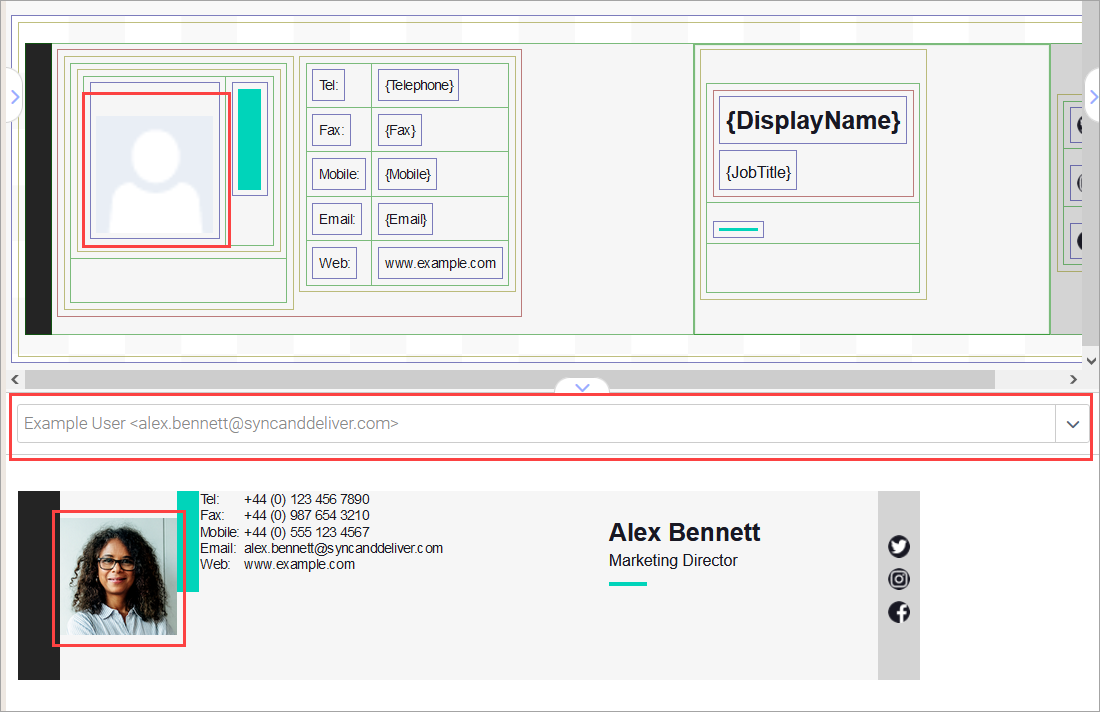
You may see a sample user in the Preview. Each user's uploaded photo is used when they send a signature.NOTE: If you have not uploaded a user photo for a user, no photo will appear in the signature. The area where the element is will appear blank. See User Photos for instructions on adding a user photo.
To delete a user photo:
- Select the element.
- Select Delete from the Properties pane.
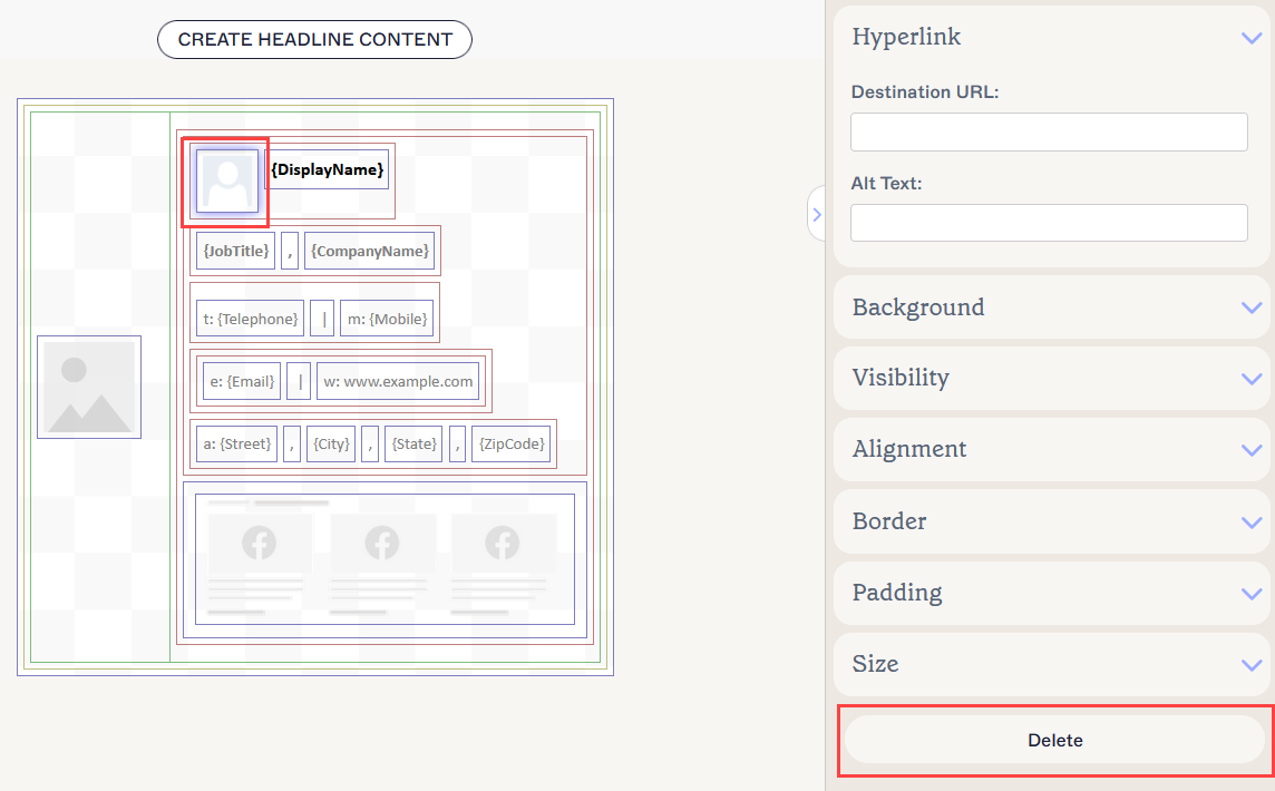
Select Delete from the Properties pane. You may need to close sections to access it.
You can edit the following element properties in the Properties pane:
Hyperlink properties
Hyperlink properties are used to apply a hyperlink to the image.
| Destination URL | Enter the URL to use in the hyperlink. |
|---|---|
| Alt Text | Enter alternate text to be shown if this image cannot be displayed. |
Background properties
Background properties are used to define the background of the item.
| Background |
Enter or select the background colour of the item. Enter transparent to set no background. You can either enter a color code or select the required color using the color picker. Brand Color 1 and Brand Color 2 appear in the color picker and contain color choices set on the Brand Kits screen. If you change these colors on the Brand Kits screen, your elements set to Brand Kit Colors will automatically update to the new color choice. |
|---|
Visibility properties
Visibility properties are used to adjust when the item appears.
| Always visible | Select to ensure the item is always visible in the signature. |
|---|---|
| Hide if User Photo was not uploaded | Select to hide the element from the template if the sender does not have a user photo uploaded. |
Alignment properties
Alignment properties are used to determine the horizontal and vertical alignment of the item.
| Horizontal | Select Left, Center, or Right to set the horizontal alignment. |
|---|---|
| Vertical | Select Top, Center, or Bottom to set the vertical alignment. |
Border properties
Border properties are used to set borders on the item.
| All |
Check All the same to enable the All border properties. Select line style, line width, and line colour to apply to all sides of the item. Brand Color 1 and Brand Color 2 appear in the color picker and contain color choices set on the Brand Kits screen. If you change these colors on the Brand Kits screen, your elements set to Brand Kit Colors will automatically update to the new color choice. |
|---|---|
| Left / Right / Top /Bottom | Uncheck All the same to enable individual border properties for Left, Right, Top, and Bottom. Select line style, line width, and line colour to apply to each side of the item. |
Padding properties
Padding properties are used to define spacing for the item.
| All | Check All the same to enable the All padding properties. Enter either a pixel or point value to apply padding to all sides of the item. |
|---|---|
| Left / Right / Top /Bottom | Uncheck All the same to enable individual padding values for Left, Right, Top, and Bottom. Enter either a pixel or point value to apply padding to each side of the item. |
Size properties
Size properties are used to define the size of the selected field.
| Width |
Enter a pixel (px) or point (pt) value to set the width of the item. Set EITHER the Width OR Height value to auto to allow the item to automatically adjust based on viewer size. Setting both values to auto will display the image at its standard size. |
|---|---|
| Height |
Enter a pixel (px) or point (pt) value to set the width of the item. Set EITHER the Width OR Height value to auto to allow the item to automatically adjust based on viewer size. Setting both values to auto will display the image at its standard size. |