
Description
The Rotating Banner element allows you to upload up to 15 images for a single Banner. The Banner then that cycles or 'rotates' through the images you uploaded. This image rotation can be customized to control when the Banner changes the image on display.
How to access it
- Open your signature in the Signature Designer.
For more information, see how to select a signature to edit.
- From the Toolbox, expand Images & Icons and select Rotating Banner.
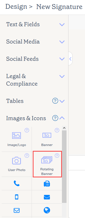
The Rotating Banner element is found in the Images & Icons section.
Select an option below to view the related instructions:
To add the Rotating Banner to the signature:
- Drag and drop the Rotating Banner element onto the canvas.
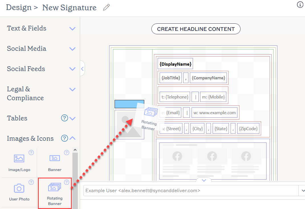
Drag the Banner to any area of the canvas.
This opens the Rotating Banner window.
-
Select Add Image to add an image placeholder to the list. You can add up to 15 images.
NOTES:
- The maximum size for images is 300KB. - The maximum total upload for the Rotating Banner cannot exceed 1MB. This means that the sum of all your image sizes must be under 1MB. You will receive an upload warning if you exceed this limit.
-The signature must still remain under our maximum email size limit of 150MB (Pro plan) or 30MB (Standard and Starter plans) to work with Server-Side deployment.
- The recommended file formats are JPG, JPEG and PNG. - To remove a banner image, select the bin icon next to the image placeholder in the list.
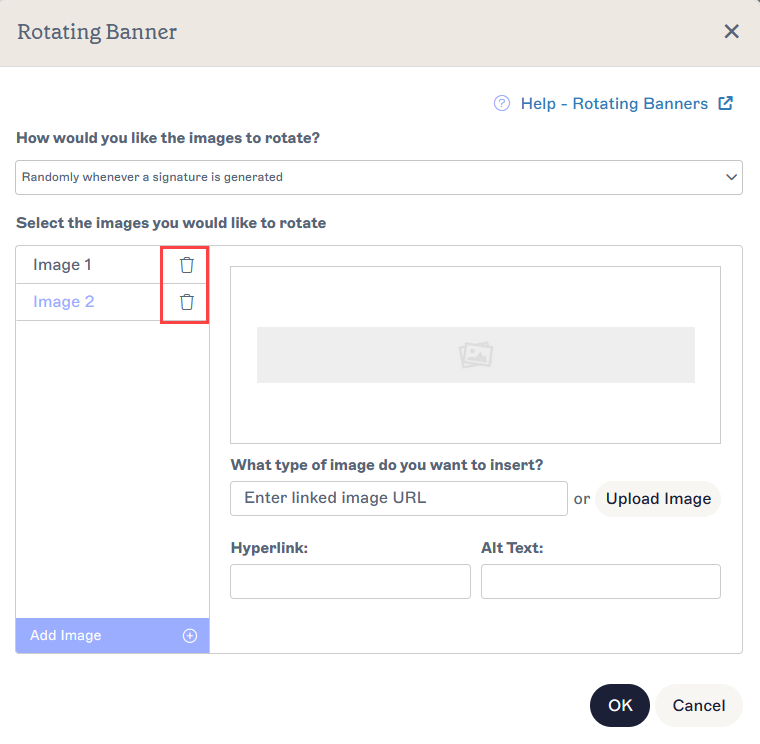
The bin icon removes an image from the list.
-
Under What type of image do you want to insert?, add your image.
NOTE: A banner image can be embedded directly into the signature, or hosted externally via a web link. For more information, read about the differences between vs. linked images in email signatures.Enter a URL to link a web-hosted image as your Banner, or select Upload Image to embed an image as your Banner.
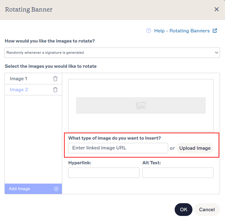
Either enter a linked image URL or upload an image file.
-
Under How would you like the images to rotate?, select a method of image rotation from the following drop-down options:
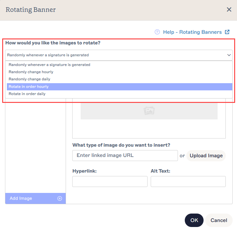
Open the drop-down to choose a rotation method.Randomly whenever a signature is generated An image will be randomly selected from the images you uploaded to display each time the signature is applied to an email.
Every email you send with this signature will have a randomly chosen image from your selection.Randomly change hourly An image will be randomly selected from the images you uploaded to display every hour.
All email signatures sent within an hour will have the same randomly chosen image, then all emails sent within the next hour will have a different randomly chosen image.Randomly change daily An image will be randomly selected from the images you uploaded to display daily.
All email signatures sent on one day will have the same randomly chosen image, then all emails sent the next day will have a different randomly chosen image.Rotate in order hourly The image will change to the next image in order of upload every hour.
All email signatures sent within an hour will have the first image you uploaded, then all emails sent in the next hour will have the second image you uploaded. This continues for all the images you uploaded. For example, if you have only two images, they are displayed on alternating hours.Rotate in order daily The images will change to the next image in order of upload every day.
All email signatures sent on one day will have the first image you uploaded, then all emails sent on the next day will have the second image you uploaded. This continues for all the images you uploaded. For example, if you have only two images, they are displayed on alternating days. - To add a hyperlink to your Banner, enter the hyperlink URL under Hyperlink.
- To add alternate text to show if the image cannot be displayed, enter your text under Alt Text.
- Select Ok to confirm your Banner settings and close the window, or select Cancel to return to the canvas without saving.
To make changes to a Rotating Banner element:
- Select the Banner and expand the Images section in the Properties pane.
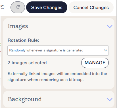
The Images properties display your rotation rule and number of images.
- To change your method of image rotation, select an option from the Rotation Rule drop-down.
- To change your images, select Manage. This re-opens the Rotating Banner window.
- To remove a banner image, select the bin icon next to the image placeholder.
- To add a banner image, select Add Image.
- Select Ok to confirm your Banner settings and close the window, or select Cancel to return to the canvas without saving.
To remove a Rotating Banner:
- Select the Banner on the canvas.
- Select Delete from the Properties pane.
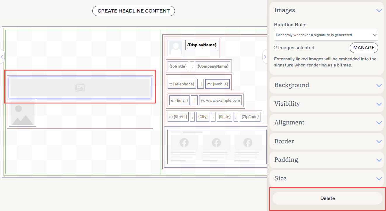
The Delete button is found in the Properties Pane. You may need to close Properties sections to view it.
You can edit the following element properties in the Properties pane:
Image properties
Image properties are used to set the image rotation.
| Rotation Rule | Select a rotation method from the drop down menu to set the rotation rule for Banner images. |
|---|---|
| Manage | Select to open the Rotating Banner window. |
Hyperlink properties
Hyperlink properties are used to apply a hyperlink to the image.
| Destination URL | Enter the URL to use in the hyperlink. |
|---|---|
| Alt Text | Enter alternate text to be shown if this image cannot be displayed. |
Background properties
Background properties are used to define the background of the item.
| Background |
Enter or select the background colour of the item. Enter transparent to set no background. You can either enter a color code or select the required color using the color picker. Brand Color 1 and Brand Color 2 appear in the color picker and contain color choices set on the Brand Kits screen. If you change these colors on the Brand Kits screen, your elements set to Brand Kit Colors will automatically update to the new color choice. |
|---|
Visibility properties
Visibility properties are used to adjust when the item appears.
| Always visible | Select to ensure the item is always visible in the signature. |
|---|---|
| Auto-hiding separator | Select to only make the item visible when there are other visible, non-separator items before and after it in the same group. |
| Visible when | Select to set conditions under which an item becomes visible. |
Alignment properties
Alignment properties are used to determine the horizontal and vertical alignment of the item.
| Horizontal | Select Left, Center, or Right to set the horizontal alignment. |
|---|---|
| Vertical | Select Top, Center, or Bottom to set the vertical alignment. |
Border properties
Border properties are used to set borders on the item.
| All |
Check All the same to enable the All border properties. Select line style, line width, and line colour to apply to all sides of the item. Brand Color 1 and Brand Color 2 appear in the color picker and contain color choices set on the Brand Kits screen. If you change these colors on the Brand Kits screen, your elements set to Brand Kit Colors will automatically update to the new color choice. |
|---|---|
| Left / Right / Top /Bottom | Uncheck All the same to enable individual border properties for Left, Right, Top, and Bottom. Select line style, line width, and line colour to apply to each side of the item. |
Padding properties
Padding properties are used to define spacing for the item.
| All | Check All the same to enable the All padding properties. Enter either a pixel or point value to apply padding to all sides of the item. |
|---|---|
| Left / Right / Top /Bottom | Uncheck All the same to enable individual padding values for Left, Right, Top, and Bottom. Enter either a pixel or point value to apply padding to each side of the item. |
Size properties
Size properties are used to define the size of the selected field.
| Width |
Enter a pixel (px) or point (pt) value to set the width of the item. Set EITHER the Width OR Height value to auto to allow the item to automatically adjust based on viewer size. Setting both values to auto will display the image at its standard size. |
|---|---|
| Height |
Enter a pixel (px) or point (pt) value to set the width of the item. Set EITHER the Width OR Height value to auto to allow the item to automatically adjust based on viewer size. Setting both values to auto will display the image at its standard size. |