
Description
The Brand Kits feature allows you to upload and set different signature features as brand options. You can then apply the Brand Kit to your signatures to create consistent designs across all signatures that use your customized branding. Each kit can have different assets applied.
The Brand Kits feature uses signature elements to draw assets into your signature from a specific Brand Kit you have created. This means that when you create or edit the assets in a Brand Kit, all signatures that have the asset applied are automatically updated.
Starter plans can only create one Brand Kit.
Standard plans can create up to three Brand Kits.
Pro plans can create an unlimited number of Brand Kits.
For more information on pricing and plans, see Exclaimer pricing plans.
How to access it
- From the header bar, select the cogwheel icon to open the Settings menu.
- Select Brand Kits. This opens the Brand Kits screen, which shows any created Kits in a list.
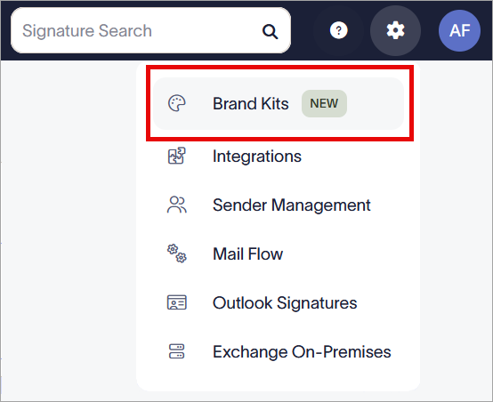
The Settings menu is found under the cogwheel icon.
Creating and viewing Brand Kits
Each Brand Kit contains its own assets. To apply any brand assets, you must first create a Brand Kit.
To create a Brand Kit:
- Select Create Brand Kit. This opens the Brand Kit screen.
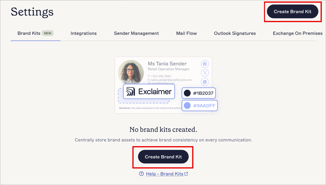
Select Create Brand Kit.
- In the Brand Kit Name field, enter a name for your new Brand Kit.
- Set your branding assets as desired, then in the unsaved changes banner, select Save. For instructions on using each of the available assets, see the following section(s) of this article.
When you create a new Brand Kit, you can set values for any of the available brand assets. These assets are Fonts, Colors, Logo, Icon, Banner, Meeting Background, and Disclaimer. Each asset is optional.
The maximum size for images uploaded to Exclaimer is 300KB.
Select an option below to view the related instructions:
The Fonts asset allows you to set two fonts as brand font choices for text. Each font can also have one Fallback, which will be used if your chosen font is not available.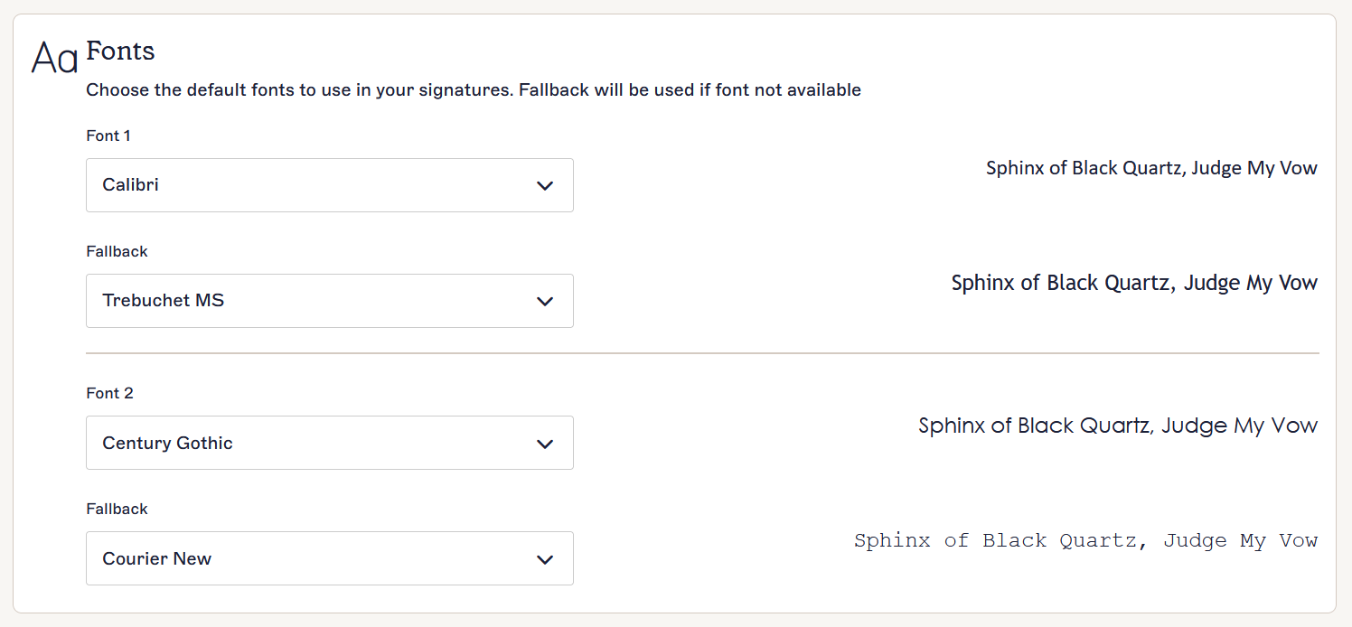
The Fonts section.
To set Fonts:
- Select the entry field under Font 1 and/or Font 2.
- Select a default font from the drop-down list. The preview text automatically updates to show you how your chosen font will look. You cannot upload custom fonts; you must choose a font from the list.
- Select the entry field under Fallback to choose a font to display if the chosen font cannot be.
- Choose a Fallback font from the drop-down list. The preview text automatically updates to show you how your chosen font will look.
- Select Save from the unsaved changes banner, or select Cancel to revert all changes.

The Save/Cancel banner appears on the screen when you have any unsaved changes.
The Colors asset allows you to choose two colors to set as brand color choices for any color setting in the Signature Designer, including text color, border color, background color, and foreground color.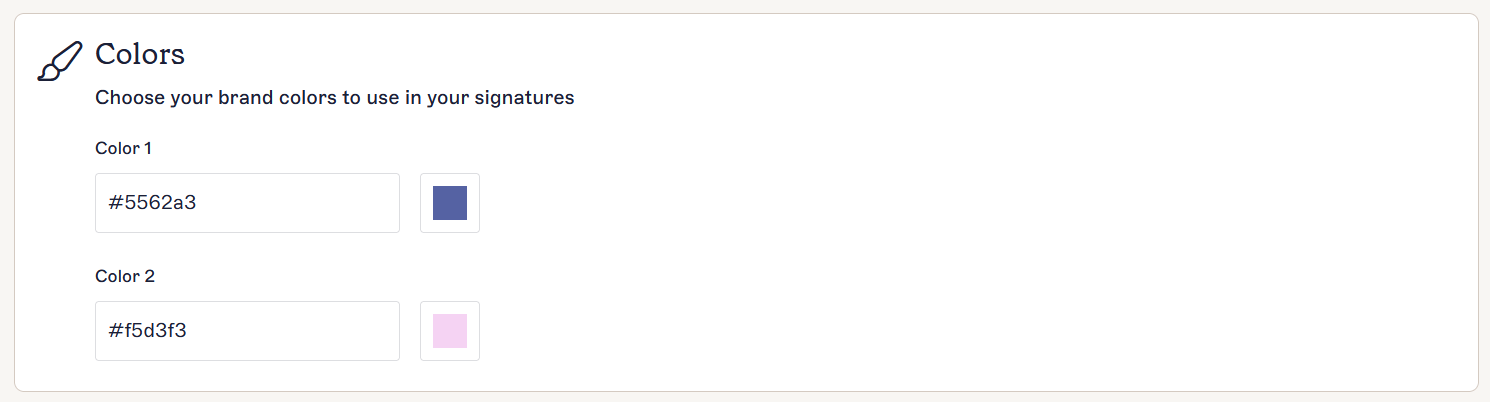
The Colors section.
To set a Color:
- Under Color 1 and/or Color 2, EITHER:
Enter a color hexcode in the entry field.
OR
Select the colored square next to the entry field to open the color picker. Within the color picker, you can use the color slider and/or the gradient map to choose your color.
- Select Save from the unsaved changes banner, or select Cancel to revert all changes.
The Save/Cancel banner appears on the screen when you have any unsaved changes.
The Logo asset allows you to upload a small rectangular image, suitable for logos. We recommend that you use an image with a transparent background.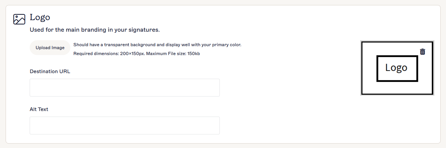
The Logo section.
To add, edit, and remove a Logo:
- To add a Logo, select Upload an Image.
- Choose your image file and select Open.
-
Your image is opened in the Edit and Save Brand Image window. Adjust your image to fit inside the preview box. You can use the slider to zoom in or out on your image, enter a zoom percentage in the entry field, and/or drag your image to reposition it. You can also resize the preview box by dragging the corners. The dimensions of your final image are displayed under the preview.
To revert your adjustments and begin again, select Reset. This does not cancel the upload - to cancel the upload, select the X icon.NOTE: Animated GIFs cannot be resized.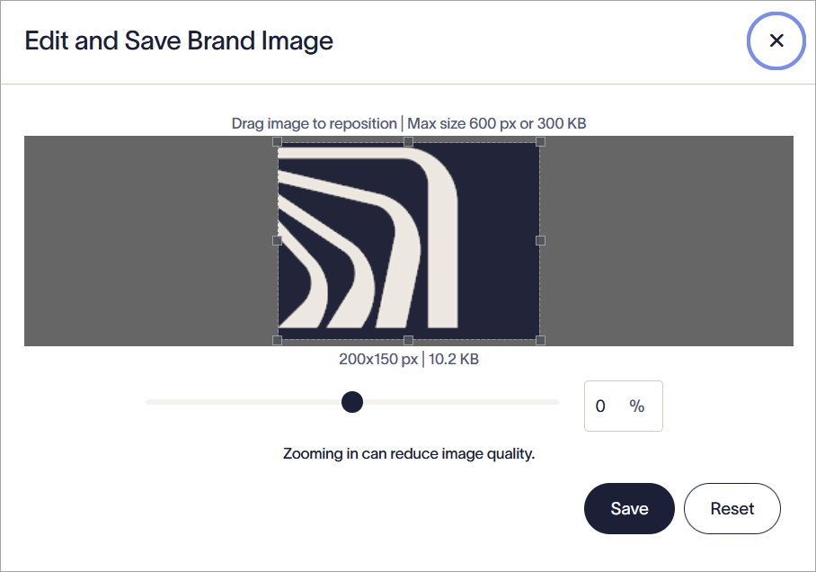
The Edit and Save Brand Image window.
- Select Save to upload your final image. Your image is displayed in the Logo section.
- To replace an uploaded Logo with a new image, select Upload image and choose a new file.
- To add a hyperlink to your image, enter the web address you want to send the user to in the Destination URL text box.
- To add alternate text, which is shown if the image cannot be displayed or used for screen readers, enter your text in the Alt Text text box.
- To delete a Logo, select the bin icon on the Logo image.
- Select Save from the unsaved changes banner, or select Cancel to revert all changes.
The Save/Cancel banner appears on the screen when you have any unsaved changes.
The Icon asset allows you to upload a small square image, suitable for icons. We recommend that you use an image with a transparent background.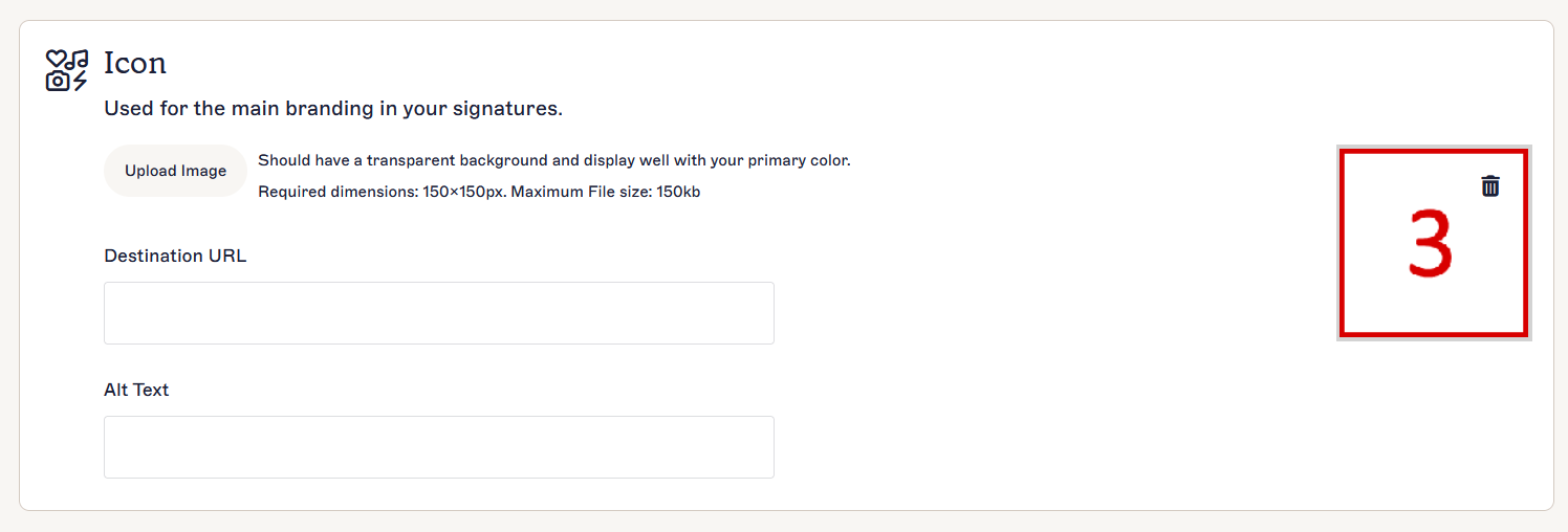
The Icon section.
To add, edit, and remove an Icon:
- To add an Icon, select Upload an Image.
- Choose your image file and select Open.
-
Your image is opened in the Edit and Save Brand Image window. Adjust your image to fit inside the preview box. You can use the slider to zoom in or out on your image, enter a zoom percentage in the entry field, and/or drag your image to reposition it. You can also resize the preview box by dragging the corners. The dimensions of your final image are displayed under the preview.
To revert your adjustments and begin again, select Reset. This does not cancel the upload - to cancel the upload, select the X icon.NOTES: Icons must be square. Animated GIFs cannot be resized.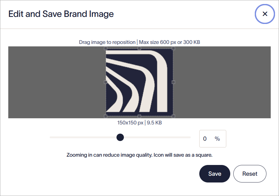
The Edit and Save Brand Image window.
- Select Save to upload your final image. Your image is displayed in the Icon section.
- To replace an uploaded Icon with a new image, select Upload image and choose a new file.
- To add a hyperlink to your image, enter the web address you want to send the user to in the Destination URL text box.
-
To add alternate text, which is shown if the image cannot be displayed or used for screen readers, enter your text in the Alt Text text box.
NOTE: Hyperlinks and Alt Text are not applied to Icons in Meeting Branding. These will only apply to Icons in signatures. - To delete an Icon, select the bin icon on the Icon image.
- Select Save from the unsaved changes banner, or select Cancel to revert all changes.
The Save/Cancel banner appears on the screen when you have any unsaved changes.
The Banner asset allows you to upload a wide rectangular image, suitable for banners, headers, and footers. We recommend that you use an image with a transparent background.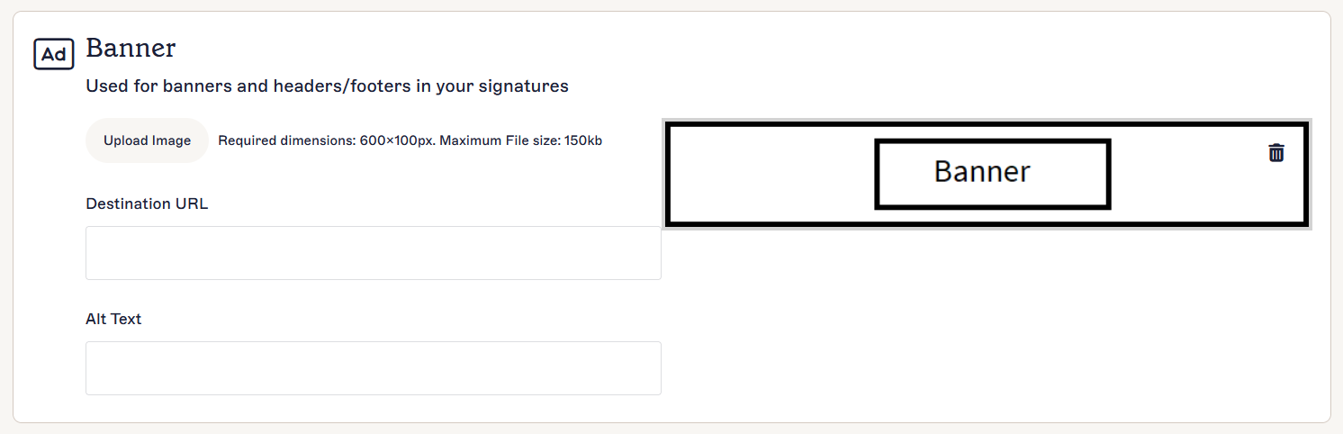
The Banner section.
To add, edit, and remove a Banner:
- To add a Banner, select Upload an Image.
- Choose your image file and select Open.
-
Your image is opened in the Edit and Save Brand Image window. Adjust your image to fit inside the preview box. You can use the slider to zoom in or out on your image, enter a zoom percentage in the entry field, and/or drag your image to reposition it. You can also resize the preview box by dragging the corners. The dimensions of your final image are displayed under the preview.
To revert your adjustments and begin again, select Reset. This does not cancel the upload - to cancel the upload, select the X icon.NOTE: Animated GIFs cannot be resized.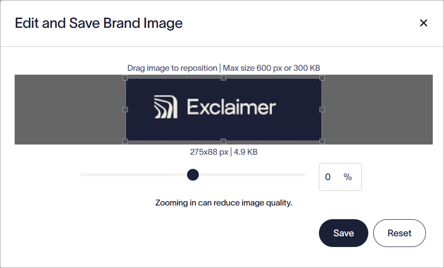
The Edit and Save Brand Image window.
- Select Save to upload your final image. Your image is displayed in the Banner section.
- To replace an uploaded Banner with a new image, select Upload Image and choose a new file.
- To add a hyperlink to your image, enter the web address you want to send the user to in the Destination URL text box.
- To add alternate text, which is shown if the image cannot be displayed or used for screen readers, enter your text in the Alt Text text box.
- To delete a Banner, select the bin icon on the Banner image.
- Select Save from the unsaved changes banner, or select Cancel to revert all changes.
The Save/Cancel banner appears on the screen when you have any unsaved changes.
The Meeting Background asset allows you to upload an image to use as a video background for the Meeting Branding feature for Zoom.

The Meeting Background section.
To add or remove a Meeting Background:
- To add a Background, select Upload an Image.
- Choose your image file and select Open.
-
Adjust your image to fit it inside the preview box. You can use the slider to zoom in or out on your image, enter a zoom percentage in the entry field, and/or drag your image to reposition it. To revert your adjustments and begin again, select Reset. This does not cancel the upload - to cancel the upload, select the X icon.
NOTE: The dimensions of the preview box are 1920 x 1080px. This cannot be changed. If you do not want to resize your image, we recommend uploading an image file that is exactly 1920 x 1080px. For more information on resizing an image file, see our image resizing guide.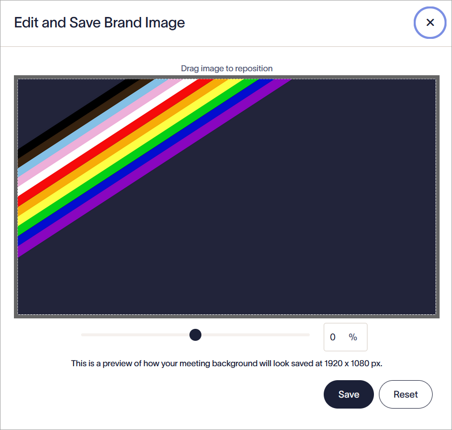
The Edit and Save Brand Image window. Use the resizing options to fit your image to the 1920 x 1080 px image dimensions.
- To replace an uploaded Background with a new image, select Upload image and choose a new file.
- To delete a Background, select the bin icon on the Background image.
- Select Save from the unsaved changes banner, or select Cancel to revert all changes.
The Save/Cancel banner appears on the screen when you have any unsaved changes.
The Disclaimer asset allows you to add up to 5000 characters of plain text for legal disclaimers or liability messages.
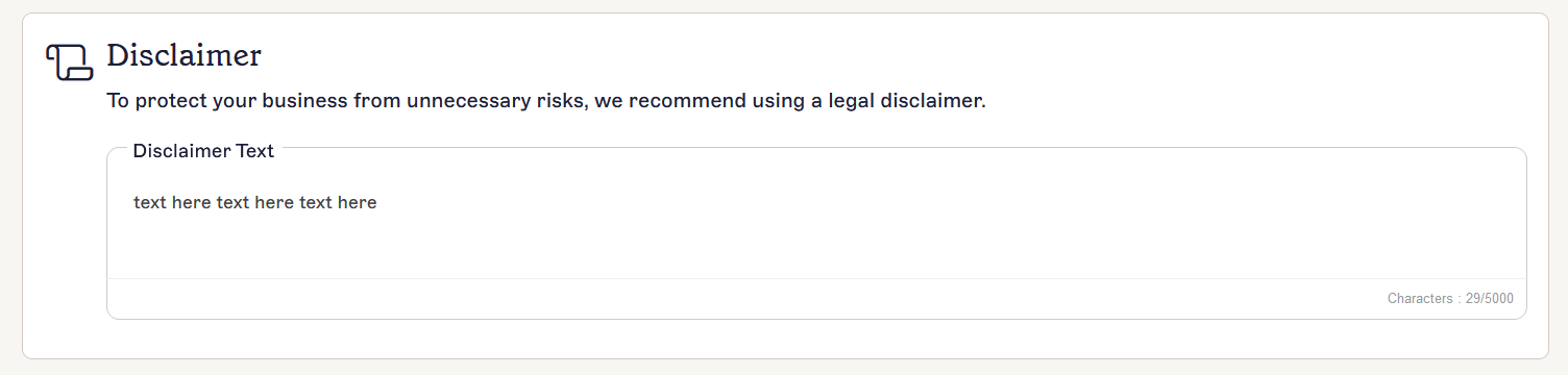
The Disclaimer section.
To add, edit, and remove a Disclaimer:
- Select within the text entry field under Disclaimer Text.
- Enter your text, up to a maximum of 5000 characters. This must be plain text.
- Select Save from the unsaved changes banner, or select Cancel to revert all changes.
The Save/Cancel banner appears on the screen when you have any unsaved changes.
Once you have created your Brand Kit, it is displayed in the list on the Brand Kits screen.
The Brand Kits screen displays a list of your Brand Kits.
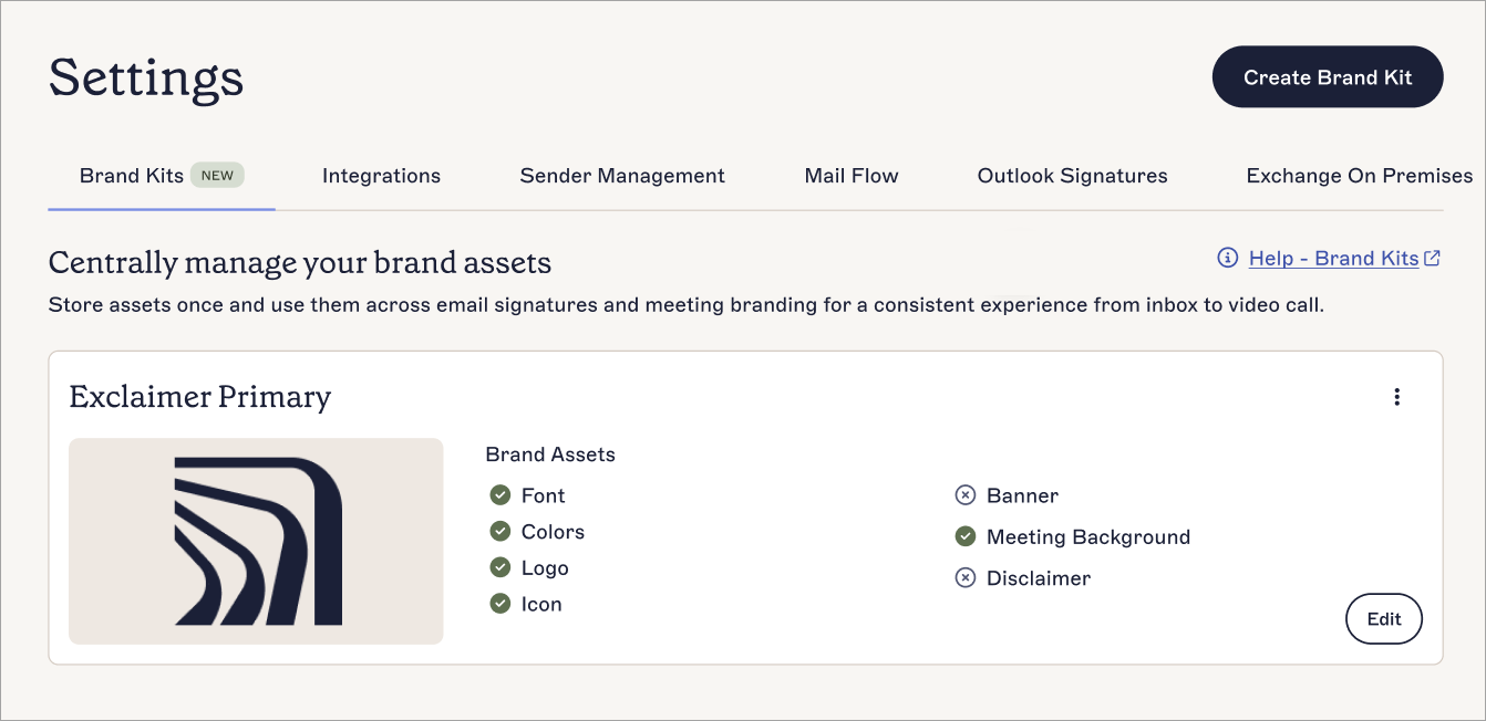
An example of a Brand Kit in the Brand Kits screen showing which assets have been set.
Each Brand Kit card displays the following data and options:
| Display | Purpose |
| Name | The name of the Brand Kit. |
| Image | An image preview of the Brand Kit, using either the Logo, Icon, or Banner, depending on what you have uploaded as an image asset. Brand Kits with no image assets have no image preview. |
| Brand Assets |
Displays which assets you have set or uploaded content for in this Brand Kit. Assets with content display a green tick icon, and assets you have not set display a cross icon.
NOTE: Font and Colors use their default values if you do not change them. This does count as set content. |
| Edit | Select Edit to adjust your brand asset content. |
| Delete - Ellipsis menu |
Select the vertical ellipsis icon to access the Delete button.
NOTE: Only users with the Owner or Admin role can delete a Brand Kit. |
| Duplicate - Ellipsis menu | Select the vertical ellipsis icon to access the Duplicate button. |